
Mississauga Humane Society Website Redesign
Helping pets find their forever homes.
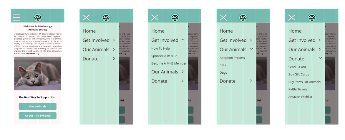
Overall redesign, layout, and to specify the objective of the nonprofit organization. Some areas of focus include the main navigation bar remodel to simplify and clarify the name of the organization as well as clarify important links by separating necessary elements like home, animals, how to help, and shop/log-in. As well as page overhaul to align elements and to shift main necessary elements to the neutral home load frame.

The Project :
UX/UI Design Group Case Study
Collaborators:
Michael Khoury
Nasim Kamgar
Gregory Ng
Dana Scanzano
Our Role: UX/UI Designer
Research
Design Challenge Overview
The Problem:
MHS was initially designed for people to support pets in Mississauga that require sponsors, foster homes, and adoptive parents. We have observed that users like Hanna are routinely confused with the repetitive features and unclear methods to support the organization.

The Solution:
Restructure & Simplify the MHS website to provide visitors with a user-friendly experience. Simplifying navigation and removing unnecessary and repetitive links create a universally cohesive visual.

We have conducted 5 user interviews with 3 tasks to test the information architecture as well as functionality and clarity of pages on the MHS website. Also, we have done a redlining method, heuristic analysis, and competitor analysis to see how can we redesign the website to solve the problem in a better way.
Interview Research Questions:
Is it easy to adopt a pet as a first-time user?
Can users easily identify all of the ways to sponsor pets?
How do users feel about the overall design of the website?
Google Survey 13 participants 11 questions
which platform would you use to browse a website like Mississauga Humane Society?
Key Insights:
Users were overwhelmed by repetitive info on how to support MHS.
Available animals & fostering sections lacked key details.
UI elements like filters and buttons are necessary for a better user experience.
Briefly review the website for a minute. On a scale of 1-5, do you feel like the website’s missions/goals are clear?
Redlining:


Competitor Analysis:

Definition
With all data we have gathered, we have created our user Persona Hanna with her Goals and pain points.

Our user Persona Hanna thinking of adopting a pet but she finds the website Mississauga Humane Society with repetitive features and unclear methods to find the right pet for herself.

Ideation
Based on our user insight statement, we have used the “I like, I wish, What if” method and voted on which features we could redesign to solve users’ problems the best. We then ranked these features using a prioritization matrix.


Prototyping
After that we mdae a task flow and user flow based on our interviews and datas, focusing on 3 main features as follows:
1:Simplification
To eliminate repetitive links and keep what is absolutely necessary.
2: Usability
Allow the user to access all necessary links and information within a few clicks.
3:Animal description
Redesign to allow users to filter and find their ideal companion.
Adoption Task Flow:

Adoption User Flow:

Sitemap:
Simplified sitemap

Sketches:
based on our user flow and sitemap we have made a sketch using InVision freehand to sketch out our wireframe for desktop and mobile.

UI Style Tile:
style guide, which is based on what the original website has. we only redesigned the MHS logo to go with the website color scheme.
MHS Logo Redesign
Original

Redesigned
Color Palette :
-

#71C1B5
-

#6B6B6B
-

#D0EBE7
-

#2D424B


Usability testing:
We conducted 4 user interviews with 3 tasks on our mid-fidelity prototype. The main feedback we received included:
Primary page labels in the nav should be clickable (instead of only the drop down arrows)
Define acronyms for the user (e.g. FIV+)
Increase font size on Footer copy and “Our Animals” description
Include feedback on the “Our Animals” filters to indicate how many results and if the user needs to take further steps
Rearrange Footer information so it’s easier to read OR create new page for Contact Info in the main nav
Refining our coaching screens to not be too overwhelming or loaded with info.
As well as moving around icons to make the page easier to read and click.


Mid-Fidelity:


Prototype Testing
Zoom Videos,4 participants,3 Tasks
Insights:
Ensure all parts of the label are clickable on the nav
Increase font size for readability
Users located tools much quicker than in our initial user tests
Hi-Fidelity:
And, finally, with all of that, we have our high-fidelity prototype…


Final Thoughts
Through our redesign of the MHS website and restructuring of its UI Architecture, we expect users to have a better experience, ultimately leading to more pets in need finding their forever homes.
